TEMPUR
DESIGNING FOR PREMIUM COMFORT
TEMPUR is a world-renowned sleep brand built on unique pressure-relieving material and a calm, Nordic expression. When TEMPUR prepared to launch its new Pro mattress line, the company used the moment to refresh its visual identity that combined modern and confident technology cues with imagery that still felt soft and restorative.
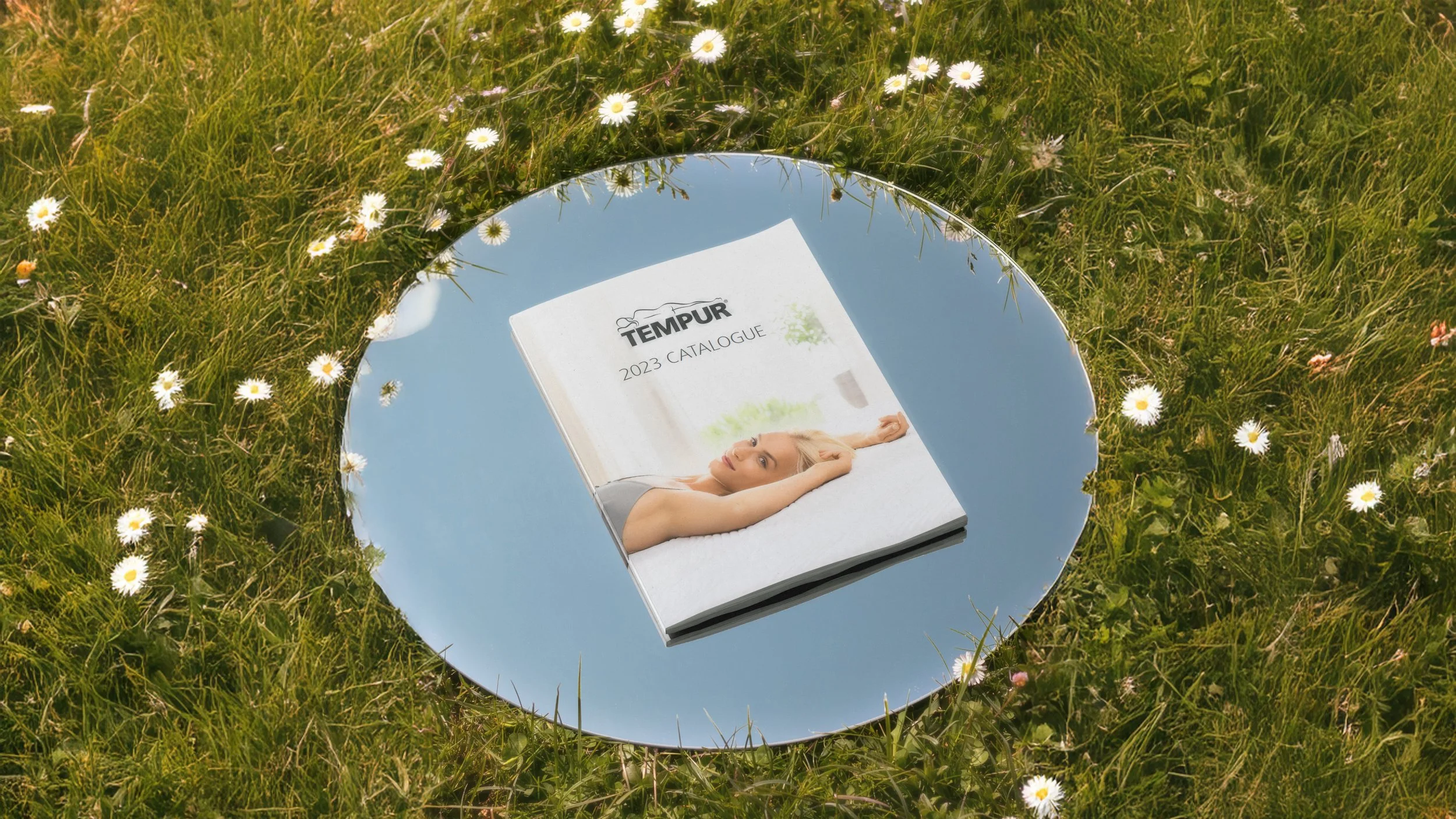
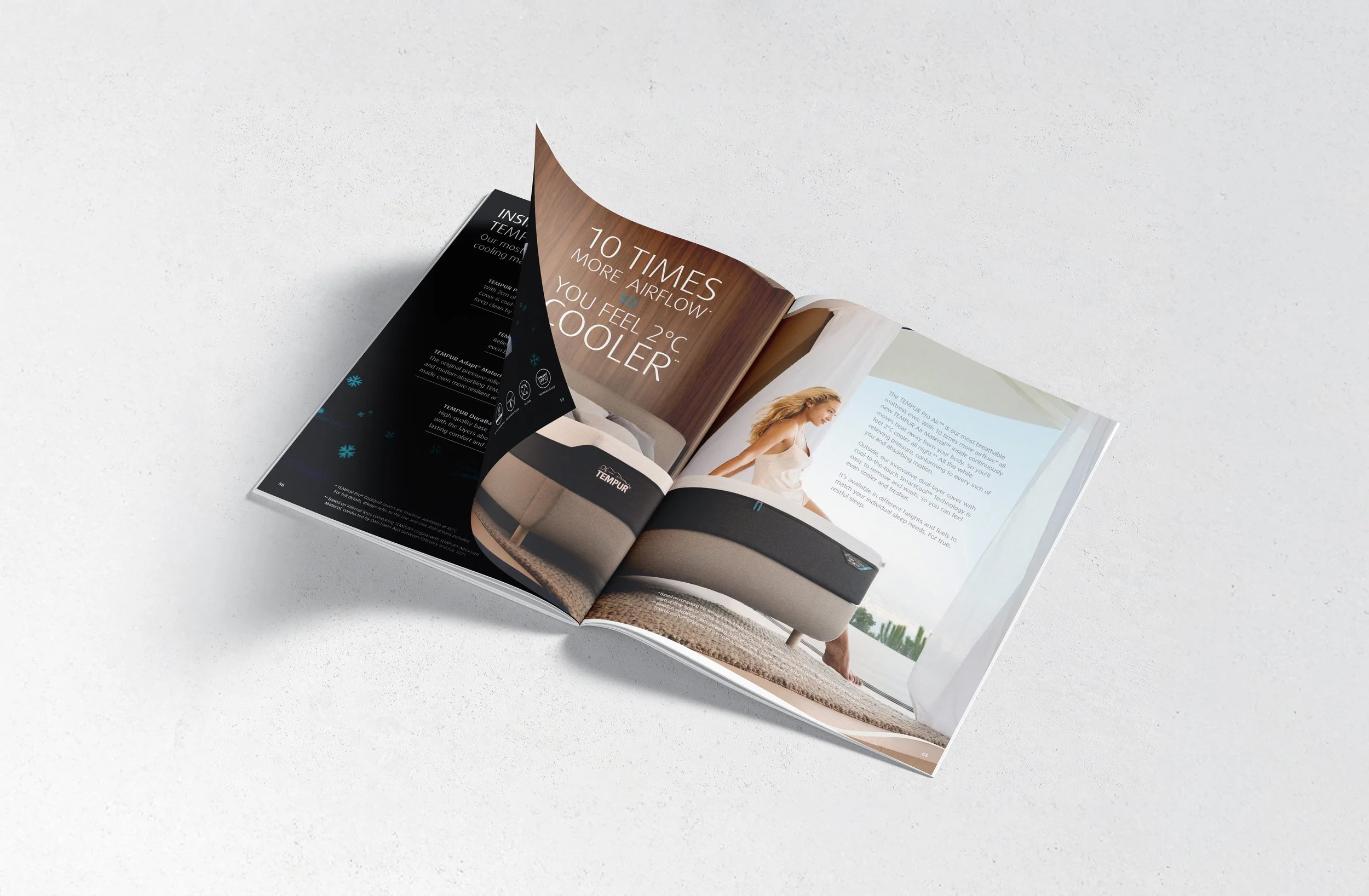
Brand Identity Refresh, Digital Banners, Storyboarding for Commercials, Art Direction on Photography Sets, Product Photography, Package Design, Iconography, In-Store Materials, Spec Sheets, Trade Sheets, Brand Guidelines, Catalogues

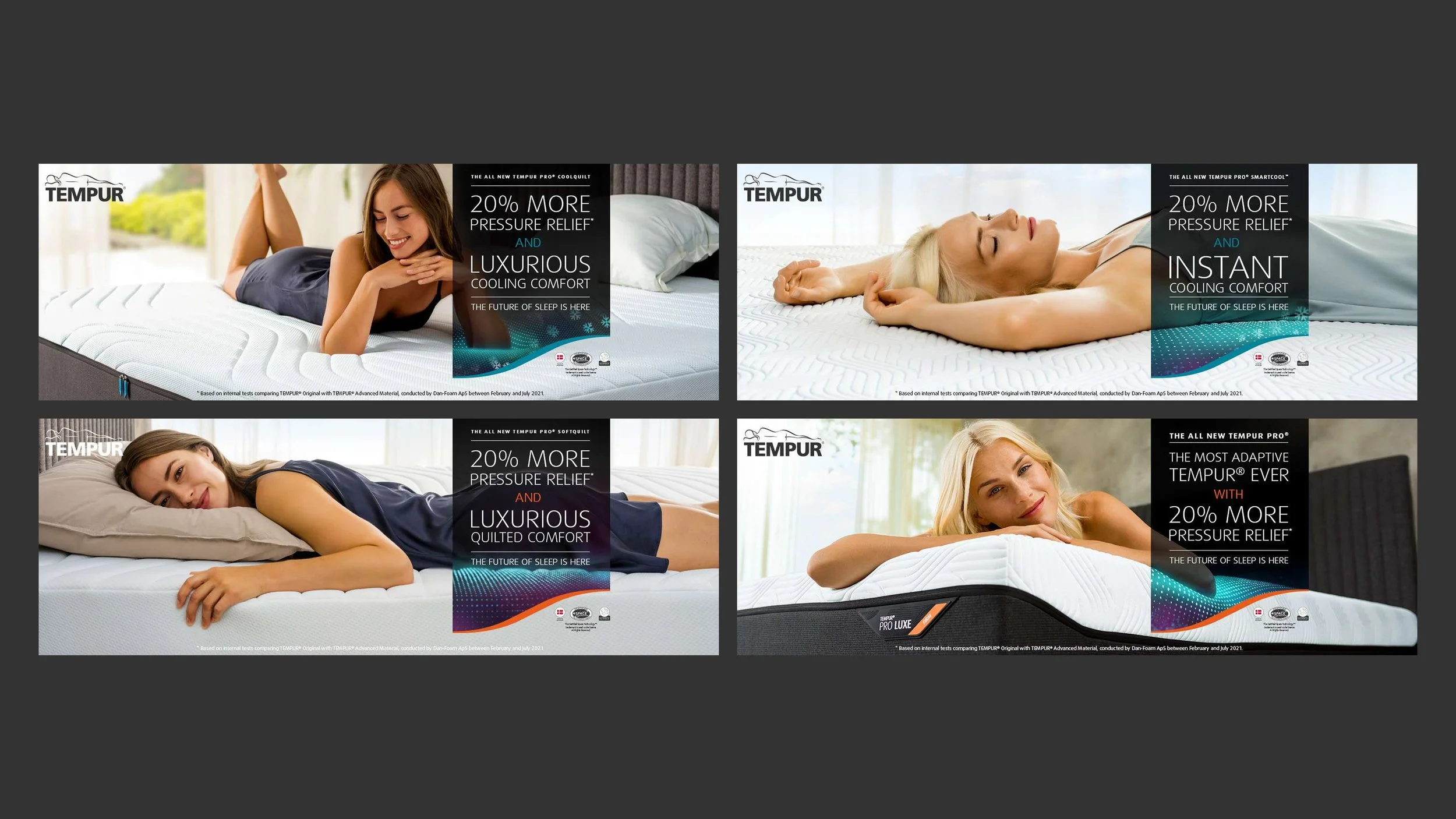
I was a core part of the agency team behind this brand refresh. Working closely with our creative director and TEMPUR’s global marketing team, I helped shape and design the new visual system for TEMPUR Pro, including layouts, bold graphical elements, refined colour palette, iconography and applications across key touchpoints. From TV and digital campaigns to product sheets, storyboards, in-store communications and sleep experience concepts, I produced more pieces than I can count.
The work shown here is a selection of highlights from an ongoing collaboration focused on making the idea of true, restful sleep feel tangible in every part of the TEMPUR brand.

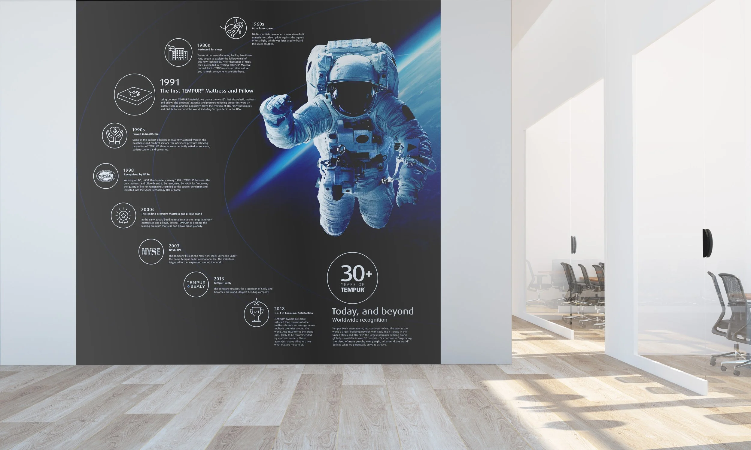
This black banner treatment was created as the consistent space for hard facts about sleep and the TEMPUR technology behind each product.

Alongside developing numerous tangible assets during my almost four years with TEMPUR, I also art directed a range of lifestyle photo shoots for different products and applications.


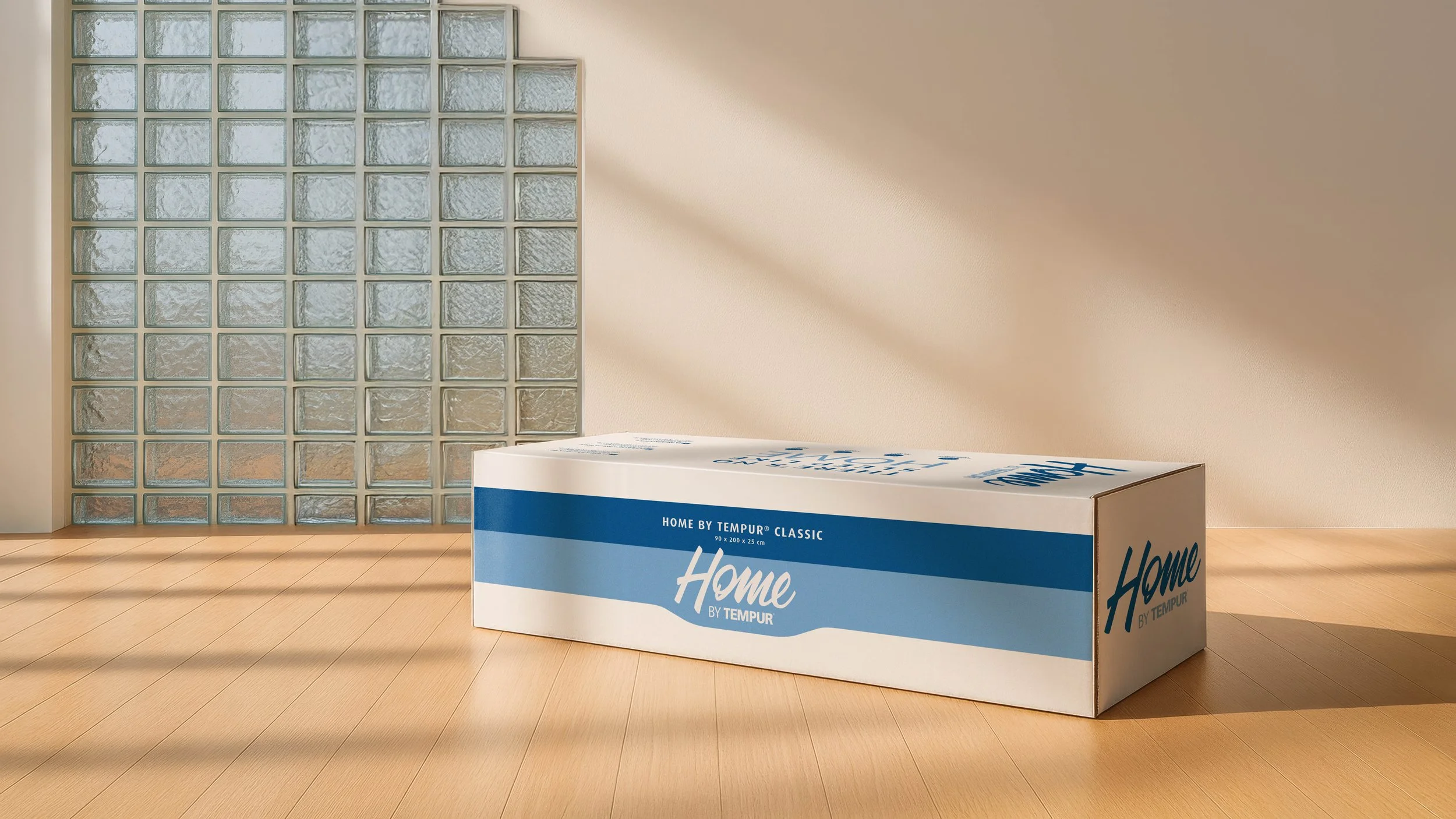
Additionally, I had the chance to design for Home by TEMPUR, a sub-brand mostly focusing on luxury bedding, home textiles and easy-ship mattresses.